Google just launched a new logo — the first major redesign in years, and a reflection of the changing nature of the search engine in all of our lives. But the site has been on a gradual evolution since it began in 1998, slow shedding the design of years past and becoming more smooth — and less objectionable. At its beginning, Google wasn’t even called by that name —it launched as “BackRub”. That site had a rather obvious picture at the top: a photo of a hairy hand on top of what appears to be skin, with large letter saying “BackRub” placed on top of it. (Independent)
Google's new logo
How does the new Google logo look
02 Eylül 2015 Çarşamba 08:20
reads.


 Advice for Enfield residents ahead of the General Election
 Sunak promises tax cuts, economic stability, Conservative Party election manifesto
 Ertan Karpazli, an independent MP candidate for the Enfield North constituency
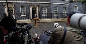
 Rishi Sunak announces a general election in a statement outside Downing Street
 Residents of Spanish island of Mallorca launch initiative to thank tourists amid protests over mass tourism
 Srebrenica Remembered, Lessons for Justice and Peace! YEE London held a reflective event
 British Premier Keir Starmer to reset UK-EU relations with high-profile meetings
 Voters head to polls for UK general election
 The Swiss official will take charge of the match between Real Madrid and Atalanta in Warsaw
 Applications are now open for Walking and Cycling Grants London until 9 September 2024
  Two Circles also appointed as exclusive media sales agency for UEFA Women’s Champions League
  England manager Gareth Southgate has resigned two days after defeat by Spain
 Joyce and Snell's planning application gets stamp of approval
 The amount of bounce back loans fully repaid is just %13
 Petrol prices higher than they should be, says RAC
 UEFA and Mastercard renew UEFA Champions League partnership


