 Enfield Labour welcomes new court order to stop antisocial behaviour in Edmonton Green
 David Lammy arrives in Downing Street after becoming deputy prime minister
 CTCA UK Condemns the Political Forcing Out of Afzal Khan MP for Engaging with Turkish Cypriots
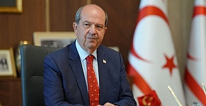 Tatar: “Reaction to MP’s TRNC visit is yet another stark example of the Greek Cypriot leadership’s primitive and domineering mentality”
 Latest! Israeli navy intercepts Global Sumud Flotilla as it approaches Gaza to break siege
 Enfield Labour Calls for Public Feedback on Crime and Safety Concerns
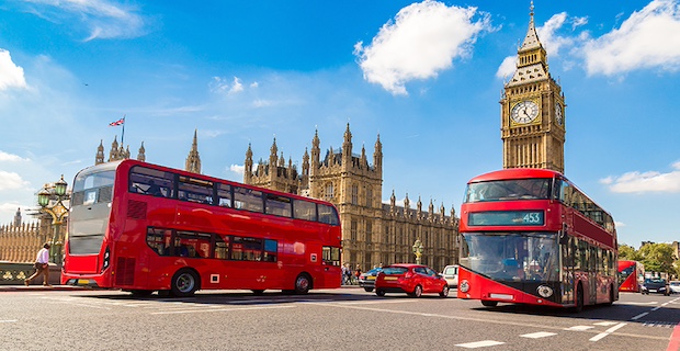
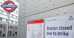 Important Travel Updates: London Underground and DLR Strike Action
 Team Enfield ranks fifteenth the in London Youth Games
 Champions League, Liverpool lose at Galatasaray
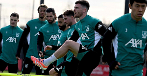 Liverpool flew out for their Champions League match against Galatasaray
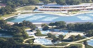 Enfield Council has approved plans for Surf London
 Zlatan Ibrahimović receives UEFA President’s Award
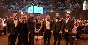 Maritime Finance and Sustainability Take Centre Stage at LISW25 Gala Dinner
 London welcomes traders back to the reopened Seven Sisters Market
 Enfield’s Crews Hill and Chase Park shortlisted for potential New Town
 Important milestone achieved with no hotel placements for temporary accommodation


The Vision Zero Inequalities Dashboard creates a new map of London, showing the stark levels of road traffic injury inequality in the capital.TfL is publishing borough level data for the first time, allowing users to identify areas and issues that most urgently need to be addressed.In London the more deprived the area, the higher the risk that someone travelling in that area will be seriously injured or killed in a road traffic collision in that area, with the 30 per cent most deprived postcodes having more than double the number of casualties per kilometre compared with the least deprived 30 per cent
Data shows how deprivation is linked to higher casualty levels, reinforcing the need to target improvements to protect those most vulnerable. Continued action is needed to achieve the Mayor’s Vision Zero goal of eliminating death and serious injury from the transport network.Transport for London (TfL) has launched its Vision Zero Inequalities Dashboard tool, creating a new map of London that shows the stark levels of road traffic injury inequality in the capital. The pioneering new tool is the first of its kind in Europe and shows how deprivation is linked to higher road casualty levels, reinforcing the need to target investment and improvements to protect those most vulnerable.
The dashboard enables users to filter the data on the relationship between deprivation levels and road casualties by year, borough, casualty severity and mode of travel, while the mapping function makes it easier to explore areas of higher casualty or casualty location rates. The risk of death and serious injury on London’s roads is an urgent public health issue and these tools will allow users to identify areas and issues that most urgently need to be addressed.
Casualty data available runs from 2017 up to the end of 2022 and will be updated annually. Remaining data covering this time period on age and gender will be added later this year. London collision data is collected by the Metropolitan Police Service (MPS) and the City of London Police (CoLP) or reported to the police by members of the public.
TfL will use the data from this dashboard to inform its own investment priorities and provide this data to boroughs to develop their Local Implementation Plans (LIPs). TfL has met and shared the findings of this dashboard with the boroughs with the top five highest casualty rates and top five highest casualty location rates. TfL will continue to work with boroughs and stakeholders to analyse the cause of inequalities in road injury, help target future road danger reduction programme planning and investment for infrastructure schemes and drive further action to reduce road danger inequalities and make London's streets safer. The Mayor of London is committed to creating a fairer, more equal and integrated city as set out in the Healthy Streets approach within The Mayor’s Transport Strategy.
The dashboard complements the Inequalities in road danger in London (2017-2021) report, published earlier this year, which focused on two areas, the collision location and the demographic characteristics of the people who are injured. This report found that in London the more deprived the area, the higher the risk that someone travelling in that area will be seriously injured or killed in a road traffic collision in that area, with the 30 per cent most deprived postcodes having more than double the number of casualties per kilometre of road network compared with the least deprived 30 per cent. The report found that the same is also true for people living in London's more deprived areas who are travelling in London as a whole. The more deprived the area someone lives in, the higher the risk they will be injured or killed in a road traffic collision wherever they are travelling in London, with people from the 30 per cent most deprived home postcodes having nearly double the risk of people from the least deprived 30 per cent. The dashboard shows that the data for people killed or seriously injured (KSI) in 2022 continues to show these trends.